 |
| Chrome Logo |
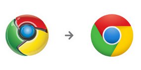
Google announced Google Chrome browser logo changes. The new logo looks more 'refined' than the previous logo.
Google seems not to change the color scheme. Blend of red, yellow and green with a blue circle in it remain a key element.
Google seems not to change the color scheme. Blend of red, yellow and green with a blue circle in it remain a key element.
The changes are quite striking is the three-dimensional effect on the old logo has been completely left out of Google. Chrome logo now looks elegant with 2D display.
Well, what is the reason Google did it change? Google designer, Steve Rura, said the change was in order to adjust to the philosophy of Chrome itself.
"Because Chrome is built with the aim of providing the best web experience easy and not messy," said Rura in Google's official blog

No comments:
Post a Comment